Frasers Property Australia
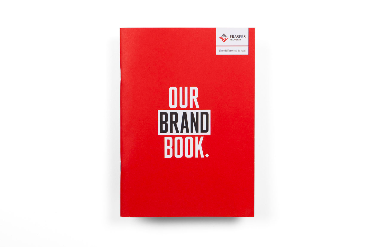
Verbal Identity and Copywriting (brand guide, brand video, brochure, website and advertising) thanks to Frost*collective.
—
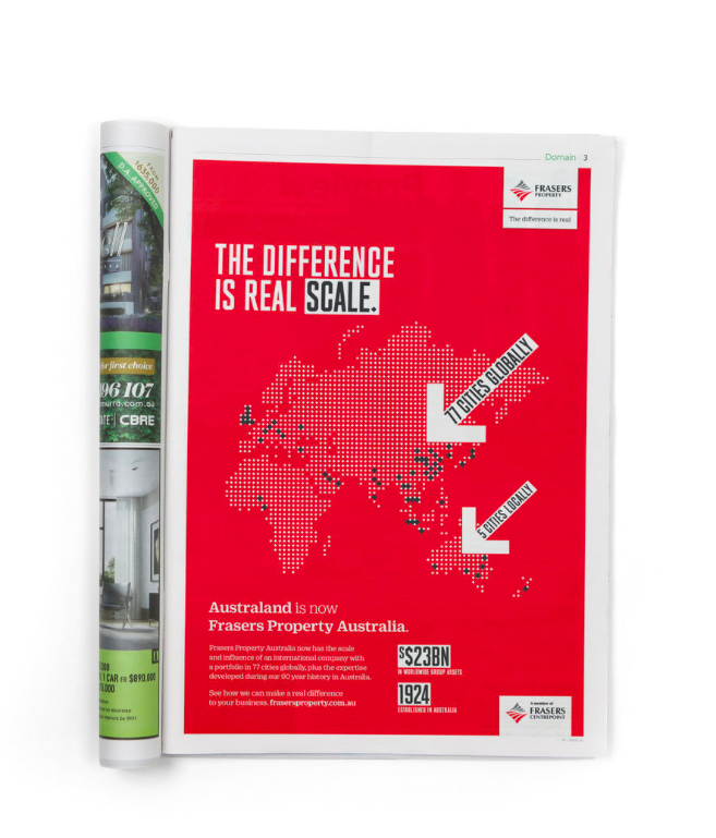
When Frasers Centerpoint Limited (FCL) acquired Australand, retaining its 90 year heritage which encompassed an established and working value system, was a major consideration. Frost* was commissioned to deliver a broad scope of deliverables spanning brand and naming strategy, design, digital and environmental branding.
A major part of the strategic process was to consider how to unify the Australian-based business with an international brand – keeping it relevant to local markets while at the same time aligning its positioning to its business operating over a much larger footprint.
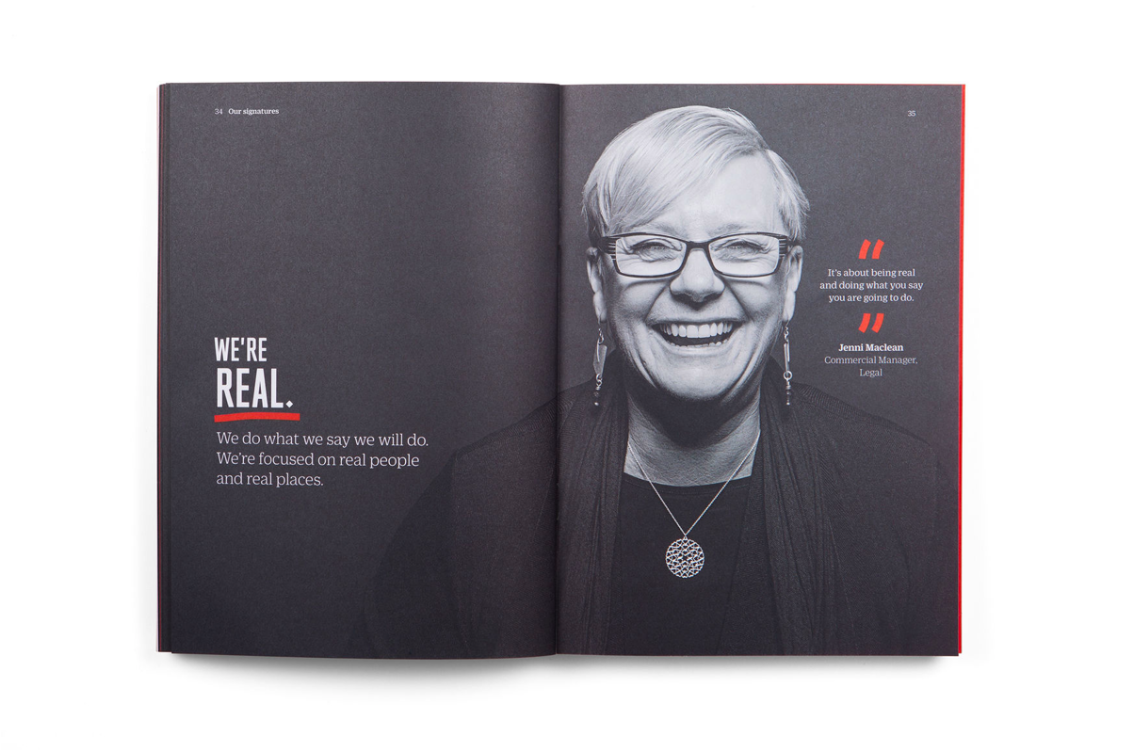
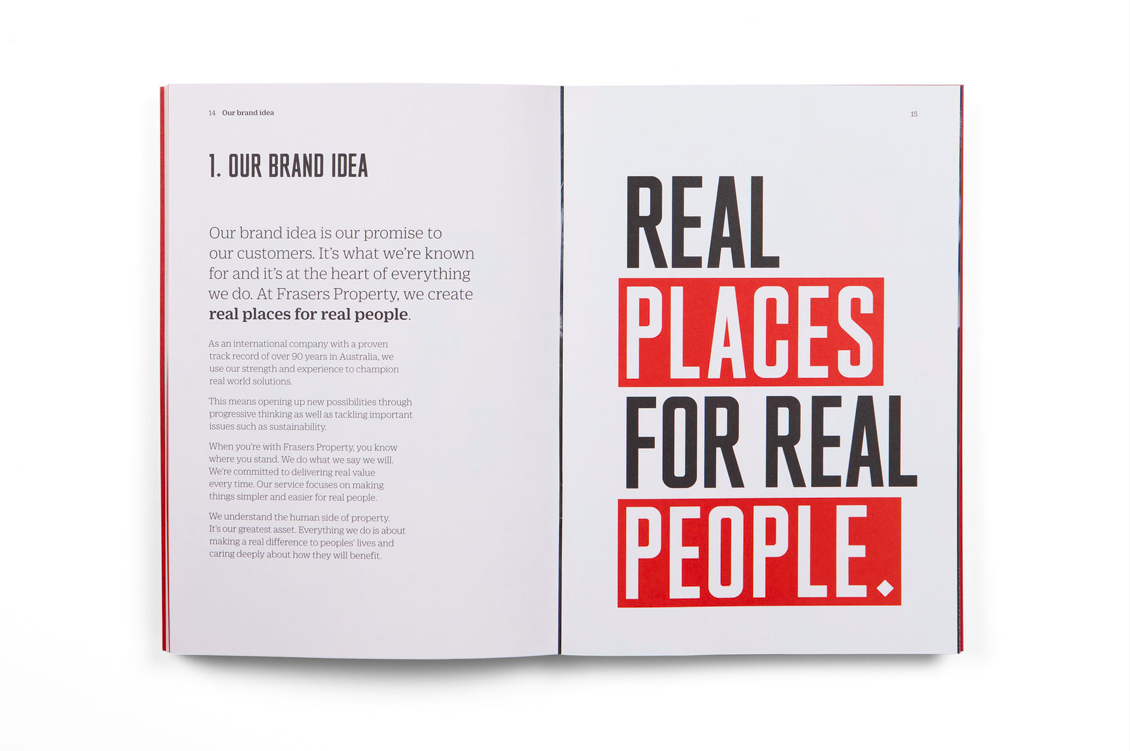
One of the key messages was communicating the strength that comes from joining with a global business and how this translates into certainty for customers. This is a major point of difference that Frasers has over players that only operate in the Australian market. The brand is anchored in the idea of ‘real places for real people’ which is embodied in the tagline - ‘The Difference is Real’. This line enables Frasers to communicate their commitment to making a genuine difference to customers as well as highlighting their point of difference in the market.
Frost* devised the brand architecture, strategic development and naming for the Frasers Property Australia brand, implementing the rebrand across all assets which included development, design and roll out of the brand’s Australian visual system for its corporate and business communications.
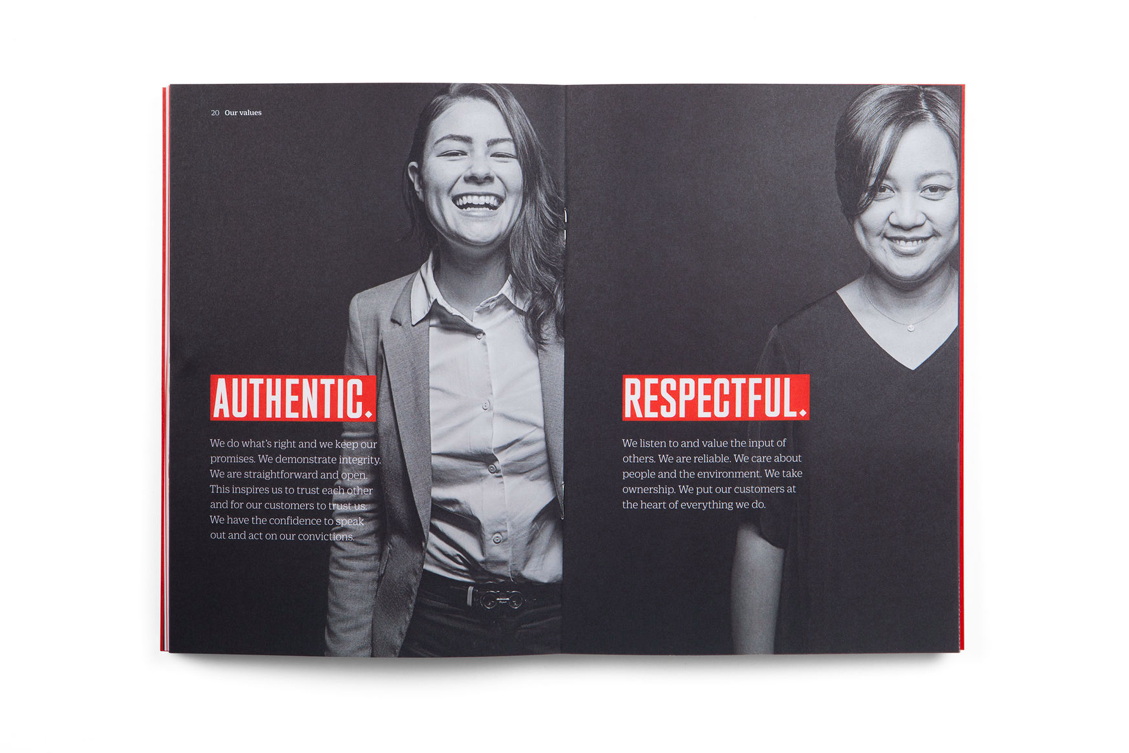
Fraser’s strengths are drawn out in the market as the leading ‘red brand’. The new visual identity system emphasises the brand’s ownership of red to increase brand visibility and impact. The brand is executed with equal consistency and impact across Frasers’ workplace environment and digital assets including website.
